
Pink Hair Filter: Try Pink Hair on Your Photo
Use a pink hair filter to compare blush, rose, magenta, and berry directions on your own photo before dyeing. Learn what an AI hair color changer can and cannot tell you.
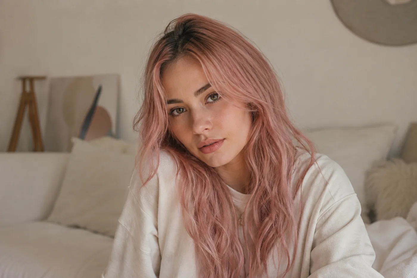
A pink hair filter is a useful way to decide which pink family you want to explore before you buy a temporary product or book a color appointment. An AI hair color changer can show the difference between muted rose, warm peach-pink, cool mauve, and deeper berry on your own photo. It cannot predict bleach needs, color chemistry, fading, or the exact shade you will get on your hair. Use the AI hair color changer to make the visual choice clearer, then use a strand test or colorist for the real-world decision.
Last updated: July 17, 2026 - about 10 min read
“Pink hair” is not one color. A dusty rose can look almost neutral in soft light. A bright candy pink can dominate a portrait. A magenta or berry shade may read as rich and dark indoors while showing a strong violet or red undertone outside. Looking at a swatch on someone else is a weak predictor because the color is framed by their skin tone, starting hair, lighting, makeup, clothes, and camera processing.
That is why the filter is valuable as a first decision. It lets you compare color directions on a stable photo of yourself, with the same face, clothing, and lighting in every version. The goal is not to promise a salon result. It is to replace “I think I want pink” with something more useful: “I prefer a muted rose that does not compete with my eyebrows,” or “the deeper berry is more like me than a pale pastel.”
Choose a pink family before choosing a product
Start by naming the visual quality you want, not a box-dye label. Do you want a soft color that reads quietly, a warm playful color, a cool editorial color, or a saturated statement? A color family is easier to compare than a long list of brand-specific shades.
| Pink direction | How it often reads in a portrait | Useful for a first preview | Real-world caution |
|---|---|---|---|
| Blush or dusty rose | Soft, muted, close to a neutral in low contrast light | Testing a subtle change that keeps the face central | May require a light base to show clearly |
| Peach-pink | Warm, sunny, and more playful | Comparing warmth beside skin and clothing | Can fade differently from a cool pink |
| Mauve or cool rose | Cooler, quieter, sometimes slightly violet | Testing a refined or less candy-like direction | Existing yellow tones can affect the result |
| Magenta or berry | High contrast, deep, and expressive | Seeing whether a bold color suits your portrait | Can stain, fade, or shift in ways a preview cannot show |
| Neon or hot pink | Immediate, bright, and graphic | Testing a deliberate statement look | Needs careful real-world maintenance and color preparation |
The point of the table is not to assign a color to a personality. It helps you decide what to test. Pick two adjacent families and one bolder option. That is enough for a first comparison.
Use a photo that shows your hair honestly
Choose a clear photo in daylight or even indoor light, with hair visible around the face and at least some length or volume in frame. Avoid beauty filters, colored lighting, hats, extreme backlight, and heavy shadows. Those conditions make it hard to tell whether you like the pink or the special effect around it.
Use the same photo for every version. Ask the tool to preserve your face, hair shape, length, texture, clothing, lighting, and background. Change only the color. A simple request is: “Keep my face, haircut, hair texture, pose, clothing, and lighting unchanged. Change only my hair to a muted dusty-rose pink with natural variation and realistic roots.”
For the second render, keep everything the same but replace “dusty-rose” with “cool mauve” or “deep berry.” This makes the comparison fair. If the tool changes the cut, makeup, room, or camera angle at the same time, you may react to the new image instead of the new hair color.
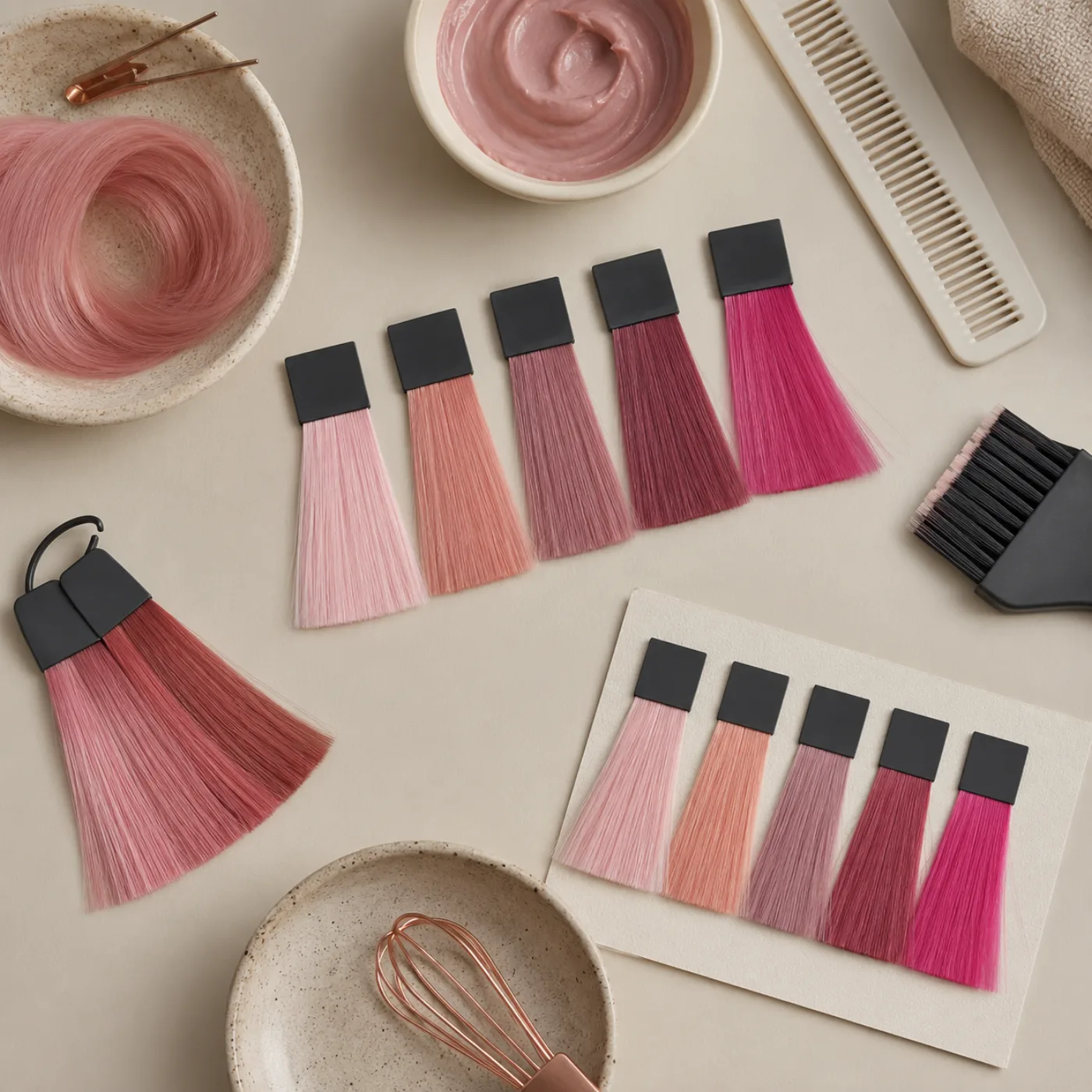
The second visual organizes color families and a real-world test step; it intentionally does not repeat the hero portrait.
Inspect the color in context
When you review a result, look beyond the first impression. Notice whether the color supports or overwhelms the features you want people to see. Compare how it sits beside your eyebrows, eyes, skin, glasses, and the neckline of the clothes in the photo.
Ask concrete questions. Does a pale blush leave the face looking clear, or does it make the overall image too low contrast? Does a saturated berry make the portrait feel confident, or does it pull attention away from the eyes? Does a warm peach-pink echo the clothing in a way you like, or does it make everything look too orange?
Also compare the root area with the lengths. A filter may make one even blanket of color look attractive, but your real choice may involve regrowth, a root shadow, highlights, or a temporary product that sits differently on different areas. Treat the render as a direction board, not a chemical simulation.
Decide between temporary, semi-permanent, and salon work after the preview
Once you know the direction, choose the real-world route with more care. A temporary spray or wash-out color can be useful for a costume, event, or short experiment. A semi-permanent color may give more saturation but still fade and behave differently depending on the starting base. A salon process may be the safest route for a major lift, an even pastel, a corrective color situation, or hair with complex history.
The preview cannot tell you which route is safe for your hair. It does not know whether you have dark color underneath, previous bleach, sensitivity, porosity, recent chemical work, or a target shade that needs pre-lightening. Read current product instructions, do the recommended allergy and strand checks, and speak with a qualified colorist for a major or uncertain change.
A three-version pink comparison
Use a simple decision set:
- Near-natural pink: a dusty rose or muted blush close to the visual intensity you normally wear.
- Most likely choice: the family you are already considering, such as cool mauve or berry.
- Stretch option: a brighter or more unusual pink that helps you identify the limit of what still feels right.
Write one sentence below each version. “I like the depth of berry but want less red.” “Mauve feels calmer with my glasses.” “The bright pink is fun, but I would not want it for work.” These notes are more useful than asking a tool to tell you which shade is objectively best.
If you are choosing a broader change at the same time, separate the tests. Preview the haircut first, then compare pink directions on the same length and shape. Combining a new fringe, new length, new makeup, and a saturated color makes it difficult to know which change you are responding to.
Be realistic about maintenance
Pink can be a high-maintenance visual choice even when the preview looks effortless. The real color may fade quickly, shift warmer or cooler, show differently on roots and lengths, or require a base that changes your hair-care routine. Ask a colorist about your starting point and about maintenance before committing. If you choose a temporary route, test it before an important event rather than applying it for the first time on the day.
For a profile photo, campaign, or school or work setting, also consider how long you want the color to be part of your visual identity. The filter can help you see whether the choice feels exciting in a still image. It cannot decide whether you will enjoy the upkeep or whether a particular setting has appearance policies. Check those facts separately.
Use the image responsibly
Only upload an image you have permission to use. Review the service policy that applies to your account. Do not represent a generated color as a guaranteed salon result, a real product photo, or someone else’s appearance. If you share a preview with a stylist, include the original photo and say which aspect of the color you like: saturation, coolness, depth, or placement.
This makes the conversation more useful. A stylist can explain what is feasible, what preparation might be needed, and how to adapt the visual direction to your actual hair. The preview becomes a clear reference instead of a promise neither person can keep.
FAQ
Can I try pink hair on my photo?
Yes. The tool can show a pink color direction on a clear portrait while keeping the rest of the photo stable. Use it to compare families such as blush, peach-pink, mauve, berry, or vivid pink before you choose a real product or service.
Is the preview accurate?
It can be accurate enough for a visual comparison of saturation, undertone, and overall mood. It cannot predict the result of bleach, dye chemistry, fading, hair condition, lighting, or the exact shade produced by a specific product.
What is the best photo for this color preview?
Use a well-lit image with your hair visible around the face and minimal filtering. Keep the same image, clothing, and lighting for each version so you can compare the color rather than a changing scene.
Should I choose a product based only on a generated preview?
No. Use the preview to pick a visual direction. Then read product instructions, follow allergy and strand-test guidance, and consult a qualified colorist when your hair history, target color, or preparation is uncertain.
Pick the pink direction before the chemistry
The filter is most useful when it turns a broad idea into a specific visual preference. Compare a few controlled shades on your own photo, note what you like about the intensity and undertone, then let a real strand test and professional advice handle the parts an image cannot know. When you are ready to compare color directions, use the AI hair color changer with one stable portrait.