
What Hair Colour Suits Me From a Photo? When Undertone Tests Disagree
When vein, jewellery, and tanning tests disagree, compare nearby warm, neutral, and cool hair-colour directions on one unfiltered photo before a salon visit.
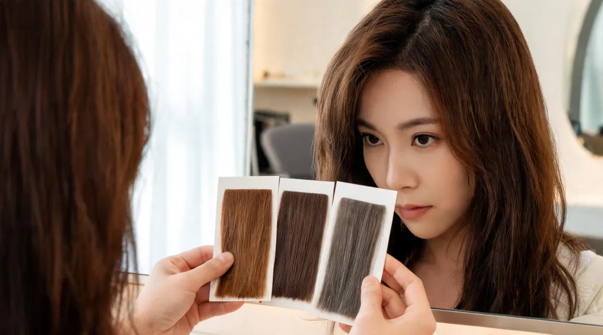
If your vein, jewellery, and tanning tests point in different directions, use one unfiltered photo to compare a warm, neutral, and cool version of a similar hair colour. Keep the pose, lighting, makeup, and depth steady; then choose the direction that gives you the clearest preference, not a permanent undertone label. The AI hair color changer can make that controlled comparison before a salon conversation, but it cannot predict a dye formula or diagnose your colouring.
Last updated: September 16, 2026 · about 7 min read
The familiar undertone checks are starting points, not a court ruling. Jewellery can reflect room colour, veins can be hard to read, and tanning history says little when skin has been protected from the sun. When the clues conflict, a photograph is most helpful as a practical decision tool: compare close colour directions on the same face, then explain what you noticed.
This is a companion to what hair color suits my skin tone, which explains the basic warm, cool, and neutral framework. Here, the question is different: what should you do when that framework does not give you a confident answer?
Do not solve a conflict by guessing harder
If two tests disagree, write down the disagreement rather than averaging it into a label. “Gold seems better in daylight, but silver photographs better indoors” is useful information. So is “my veins look greenish, but ash brown feels more natural than warm copper.” It tells you to compare directions, not to pretend the evidence is clearer than it is.
Before you generate anything, take one current portrait in indirect daylight. Keep your normal hair part visible. Avoid a beauty filter, tinted sunglasses, coloured LED lighting, or makeup that intentionally shifts warmth or coolness. You do not need a clinical image; you need a consistent baseline.
| What is conflicting? | A better response | What not to conclude |
|---|---|---|
| Vein and jewellery checks disagree | Compare warm, neutral, and cool neighbours on one image | “One test has proved my exact undertone” |
| Daylight and indoor photos look different | Use daylight as the baseline, then do a second-light reality check | “The brighter image is automatically more accurate” |
| You like two directions | Record the difference in depth, warmth, and contrast | “Only one family is allowed” |
| A preview looks unlike you | Reject it and improve the source photo | “The hair colour changed my real face” |
Undertone language is optional. The valuable outcome is a sentence you can use with a colourist, such as “I prefer the softer neutral brown to the golden version, but I do not want it to read flat indoors.”
Make a three-direction photo comparison
Choose shades that differ mainly in warmth, not in every other property. If you start with medium brown, use a warm chestnut, neutral medium brown, and soft ash brown. If you are considering blonde, compare honey beige, neutral beige, and muted ash at a similar depth. This keeps the test legible.
- Save the original portrait. It is the control for every preview. Do not crop, relight, or smooth it between versions.
- Pick three neighbours. Choose one warm, one neutral, and one cool candidate at roughly the same lightness. The brown hair filter can help name brown directions if that is your starting point.
- Use one narrow request at a time. State the shade and protect everything else: “Change only my hair to soft ash brown; keep my face, hairline, texture, length, part, lighting, and background unchanged.”
- Write a reaction, not a score. Under each version, note one visible detail: “too gold around the temples,” “like the quiet contrast,” or “good depth but too gray.”
- Keep only the best two. Your original plus one or two useful versions is a better salon reference than twenty unrelated images.
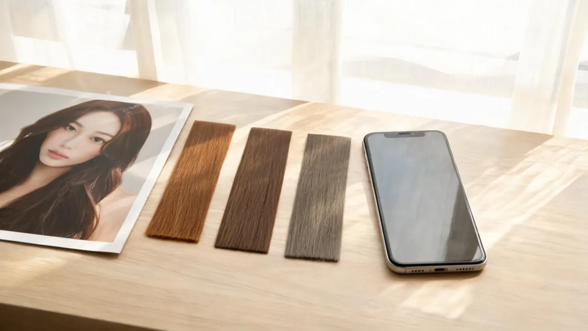
Use close colour neighbours so the comparison answers one question: how much warmth, neutrality, or coolness do you want to see around your face?
Review the result for direction, not a “best” verdict
A generated preview can make the effect of relative warmth easier to see. It cannot tell you that one shade is objectively best, and it should not persuade you by changing your features, skin texture, or room lighting. Review the output against the original at normal phone size as well as enlarged.
| Review question | A useful observation | A reason to rerun |
|---|---|---|
| Did hair colour change by itself? | Face, brows, eyes, pose, and background stay recognizable | The preview narrows the face, changes makeup, or adds a studio glow |
| Does the depth stay comparable? | All three options look like neighbours in lightness | One option has also become much darker, lighter, or more saturated |
| What happens near the face? | You can describe a preference for warmth, softness, or contrast | You only prefer the most heavily retouched image |
| Does it work in ordinary light? | The choice still feels plausible beyond a bright render | It looks good only under one dramatic lighting condition |
For a second condition, take a comparable indoor photo after you have shortlisted your colours. The two-light test for cool tone hair colors explains why this is a reality check rather than a fresh undertone diagnosis. When an option changes drastically with light, that is a useful question for a colourist about depth, dimension, or maintenance.
Turn the comparison into a salon conversation
Your stylist needs your hair history and your preferences, not a demand to reproduce a screen. Share the original image and the strongest one or two comparisons. Then describe what you want to preserve and what you want to avoid.
| Bring or say | Why it helps |
|---|---|
| Your original unfiltered portrait | Shows the real baseline behind the preview |
| One warm, neutral, or cool version you prefer | Gives a visual direction without pretending it is a formula |
| A short note about the trade-off | “I like this softness but want more dimension” is actionable |
| Your recent colour and chemical history | Lets the colourist judge what is realistic and safe |
| Your upkeep limit | Helps choose a direction that fits your real routine |
This is also where a preview has a firm boundary. It does not know your porosity, previous bleach, grey coverage needs, sensitivity, developer strength, toner, or how a colour will fade. For a warmer shortlist, the warm undertone salon consultation checklist can help you prepare questions; for a bolder change, ask what a smaller first step would look like.
Keep safety separate from visual planning
A digital result cannot patch-test dye or confirm that a chemical service is right for your hair. If you colour at home, follow the product directions and patch-test each time. The U.S. Food and Drug Administration’s hair-dye safety guidance also advises following package instructions, wearing gloves, and not mixing different dye products. If you have had a reaction, scalp irritation, extensive bleaching, or uncertain colour history, pause the at-home plan and ask a qualified professional.
The preview’s role is smaller and still useful: it helps you arrive with an honest preference. “I want less gold than this warm version, but more softness than the ash version” is far more informative than “make me the colour that suits me.”
Frequently asked questions
What hair colour suits me if I cannot tell my undertone?
Do not force a warm-or-cool label from one inconclusive test. On one clear unfiltered portrait, compare a nearby warm, neutral, and cool version of the same depth, then note which direction you prefer and what changes in the result. Take the original and your best two previews to a colour consultation.
Can a photo tell me my exact undertone?
No. Camera processing, makeup, white balance, reflections, and indoor light can all change how skin appears. A photo comparison is most useful for choosing a visual direction you want to discuss, not for making a permanent diagnosis or predicting a salon formula.
Which hair colours should I compare first?
Choose three close candidates at one depth: for example, warm chestnut, neutral medium brown, and soft ash brown. Avoid comparing black, platinum, and vivid red in the same test, because the depth and saturation differences hide the undertone question.
Is an AI hair-colour preview safe to use before dyeing?
A preview is only a visual planning tool. It does not test dye safety, hair condition, prior colour services, or whether a formula will lift or fade as expected. Follow product directions and patch-test at-home hair dye as directed; a qualified colourist can assess hair history in person.
Related guides
- Try the AI hair color changer →
- What hair color suits my skin tone?
- Test cool hair colours in two lights
- Warm undertone hair-colour salon consultation checklist
- Change hair color in a photo
Choose the direction you can explain
Open the AI hair color changer, compare three close directions on one unfiltered photo, and keep the original beside your best two results. The goal is not to prove an undertone label—it is to arrive at a salon conversation with a clear, realistic preference.